Designing a medical OTT platform that makes learning seamless for busy doctors.
Designing a medical OTT platform that makes learning seamless for busy doctors.
Matchmakers is a mobile-first digital platform that connects match-seekers with verified local matchmakers, helping people find life partners in a way that respects Indian traditions while using modern digital tools.
Unlike typical matrimony apps, Matchmakers does not replace human matchmakers — it empowers them digitally, creating a hybrid system that blends offline cultural practices with online convenience, transparency, and trust.
I worked on this project from concept to high-fidelity prototype, collaborating closely with stakeholders and playing a key role in shaping both the UX and the visual identity of the product.
Docflix
Docflix
Docflix
Role
Role
User Research, User Interviews, Prototyping, Experience Design
User Research, User Interviews, Prototyping, Experience Design
Time
Time
3 months, Jan 2022-April 2022
3 months, Jan 2022-April 2022
Tools
Tools
Figma
Figma
My role
My role
Role: UI Designer (Visual & Interaction Lead)
What I owned:
Logo design iterations from scratch
Visual identity and UI system
Light and dark mode design
Prototyping
Even though my formal scope was UI, my design decisions actively shaped:
How doctors discover content
What they engage with first
How they perceive credibility
How often they return to the platform
Challenge
Challenge
Product Perspective
Docflix needed to:
Compete with YouTube, journals, webinars, and other learning tools
Convince doctors to adopt a new platform
Position itself as scientific, reliable, and premium rather than commercial
Balance “OTT-style engagement” with “medical credibility”
Core tension:
How do you make medical learning feel engaging like Netflix, but trustworthy like a journal?
UX Perspective
Even without owning research, I had to solve real experience problems through UI:
Organizing large volumes of content without clutter
Differentiating webinars, videos, and news while keeping a unified system
Designing for busy doctors with limited time
Ensuring consistency across:
Mobile vs desktop
Light vs dark mode
The UI had to feel:
Calm
Professional
Easy to scan
Credible
Time-efficient
new monthly active
users in 2 years
conversion rate in
the first year
EBITDA
Margin Support
+0.5-1.5pp
Design Principle and key insights
Design Principle and key insights
From the stakeholder brief and team research, key insights were:
Doctors are extremely time-poor
They are overwhelmed by scattered online content
They distrust low-quality or promotional medical videos
They prefer structured, credible, and concise learning formats
Opportunity:
Create a single, centralized, high-quality medical learning platform with a streaming-style experience.
As a Product designer, my job was to visually reinforce:
Trust
Professionalism
Clarity
Ease of use
Goals
Goals
Business Goals
Establish Docflix as a trusted medical learning platform
Increase doctor engagement with Mankind Pharma content
Deliver high-production-value scientific videos
Create a scalable video-first product
Encourage repeat usage
Key success metrics:
% of registered doctors consuming content
Webinar attendance
Video views, saves, likes, and watch time
User Goals
Doctors wanted to:
Learn new medical trends quickly
Access reliable scientific content in one place
Avoid jumping between multiple apps
Prefer video-based learning
Stay updated with Webinars, Guidelines, Medical news
Core Job to Be Done:
“Help me stay clinically updated without wasting time across multiple platforms.”
Design Process
Design Process
Understanding the system
I aligned closely with the product intent:
Who the users are (doctors across India)
What types of content exist
How the business wants to position the platform
I aligned closely with the product intent:
Who the users are (doctors across India)
What types of content exist
How the business wants to position the platform
Wireframes → High-Fidelity UI
The UX team created wireframes; I translated them into final UI by:
Defining visual hierarchy
Standardizing layouts
Creating reusable components
Designing clear CTAs .
The UX team created wireframes; I translated them into final UI by:
Defining visual hierarchy
Standardizing layouts
Creating reusable components
Designing clear CTAs .
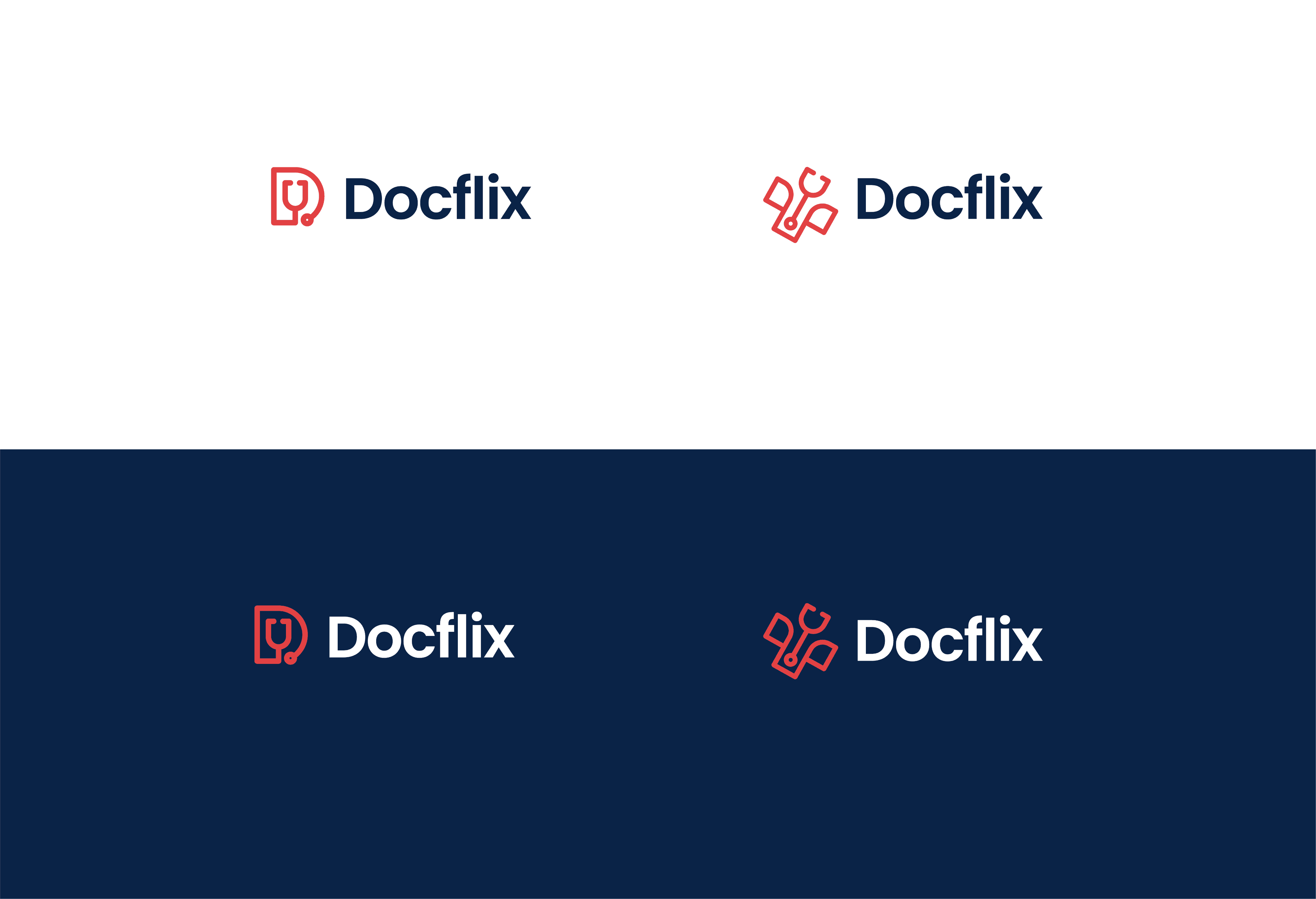
Logo & Visual Identity
I worked on multiple logo iterations, considering:
Medical symbolism
Professional tone
Modern digital aesthetics
I worked on multiple logo iterations, considering:
Medical symbolism
Professional tone
Modern digital aesthetics
UI Iterations
I explored multiple UI styles before finalizing a direction that was:
Minimal
Clean
Medical-friendly
Netflix-inspired but professional
I explored multiple UI styles before finalizing a direction that was:
Minimal
Clean
Medical-friendly
Netflix-inspired but professional
1
3
5
7
9
2
4
6
8
10
Final UI Screens
Final UI Screens
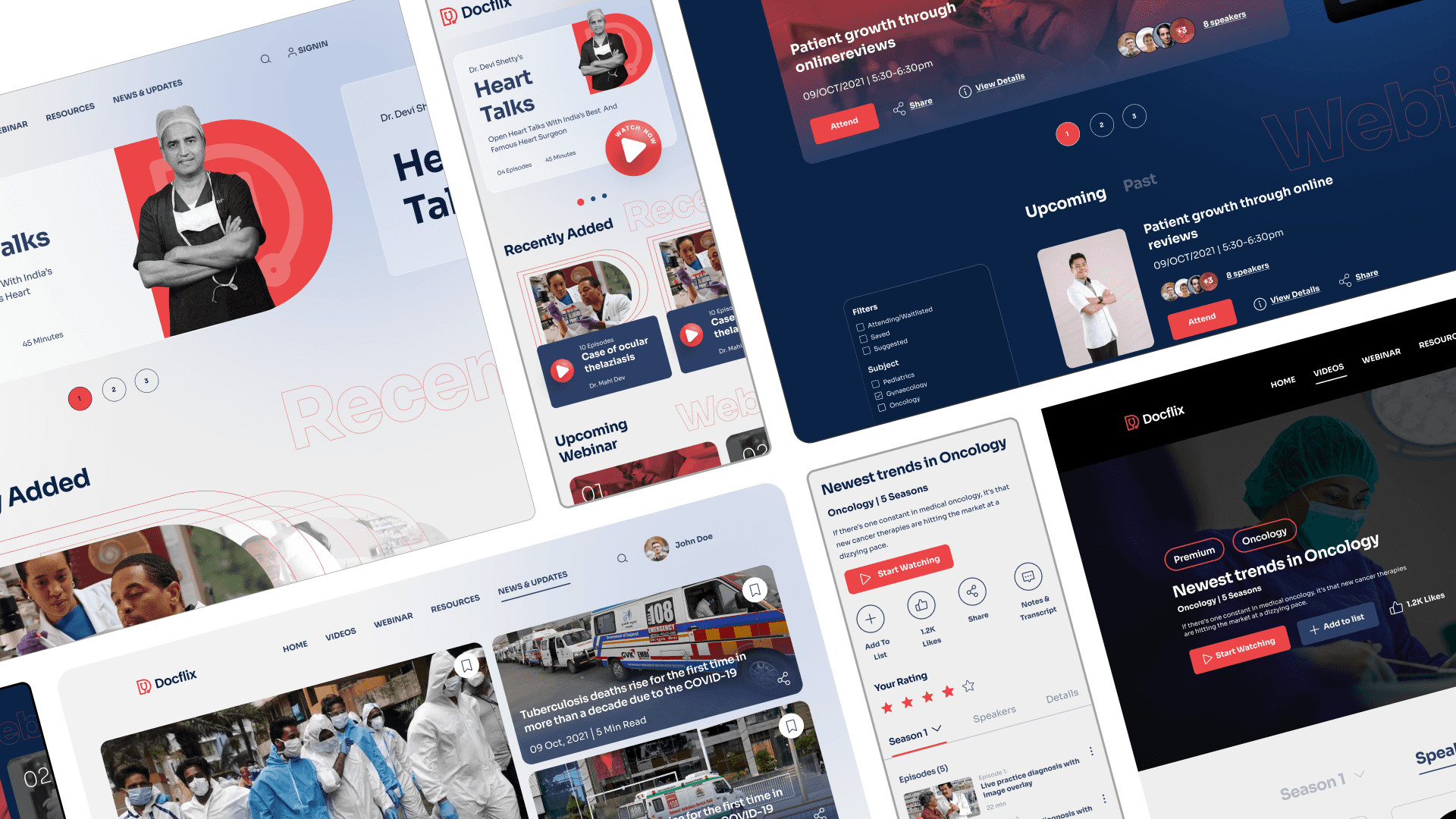
These are the final uI screens which I worked on, which was presented to the client and approved by them. We worked on creating both dark mode and light mode for mobile responsive and website. Focus was to create a better visual experience for the doctors.
These are the final uI screens which I worked on, which was presented to the client and approved by them. We worked on creating both dark mode and light mode for mobile responsive and website. Focus was to create a better visual experience for the doctors.
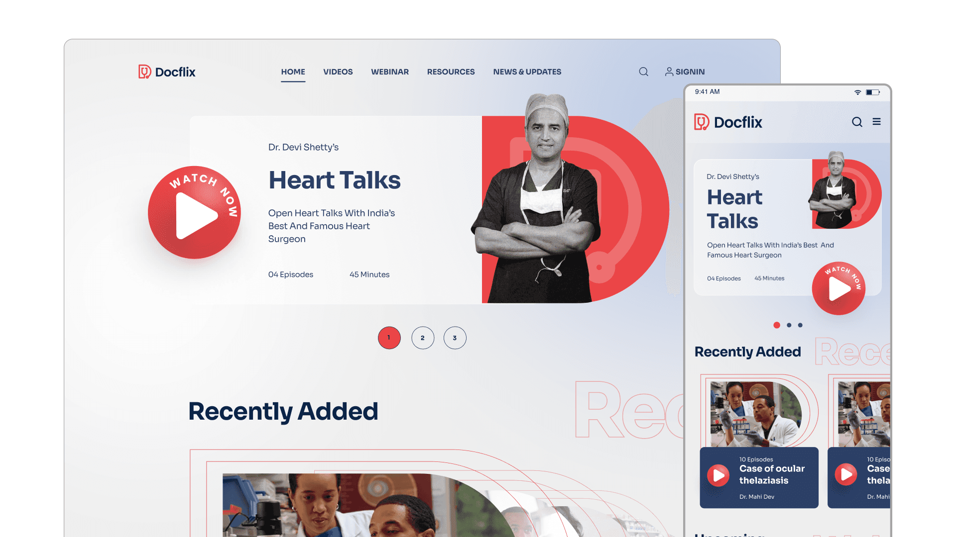
Homepage
Homepage
This screen shows all the top videos, recently added videos, upcoming webinar and
healthcare updates.
This screen shows all the top videos, recently added videos, upcoming webinar and healthcare updates.
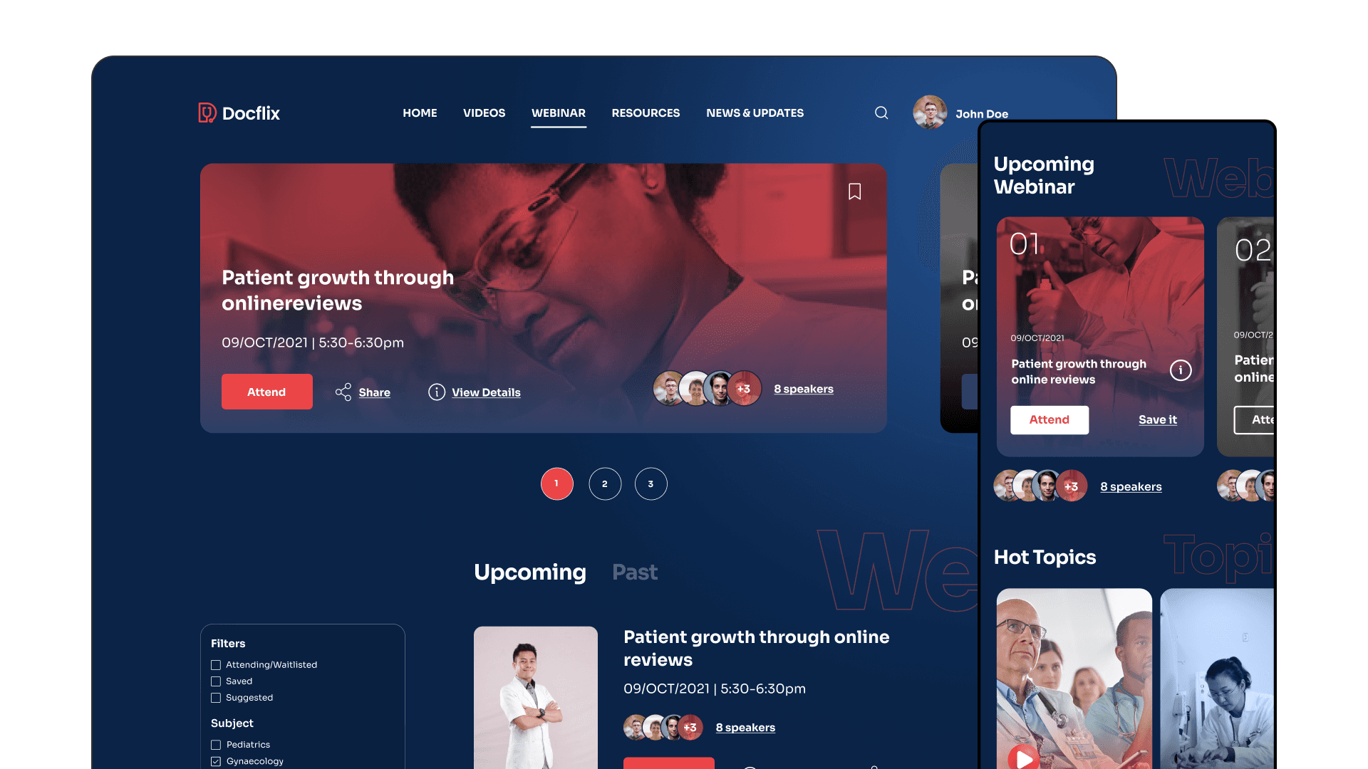
Webinar Page
This screen shows the videos related to webinar and all the upcoming and past webinars,
you can also filter out according to your choice .
This screen shows the videos related to webinar and all the upcoming and past webinars, you can also filter out according to your choice .
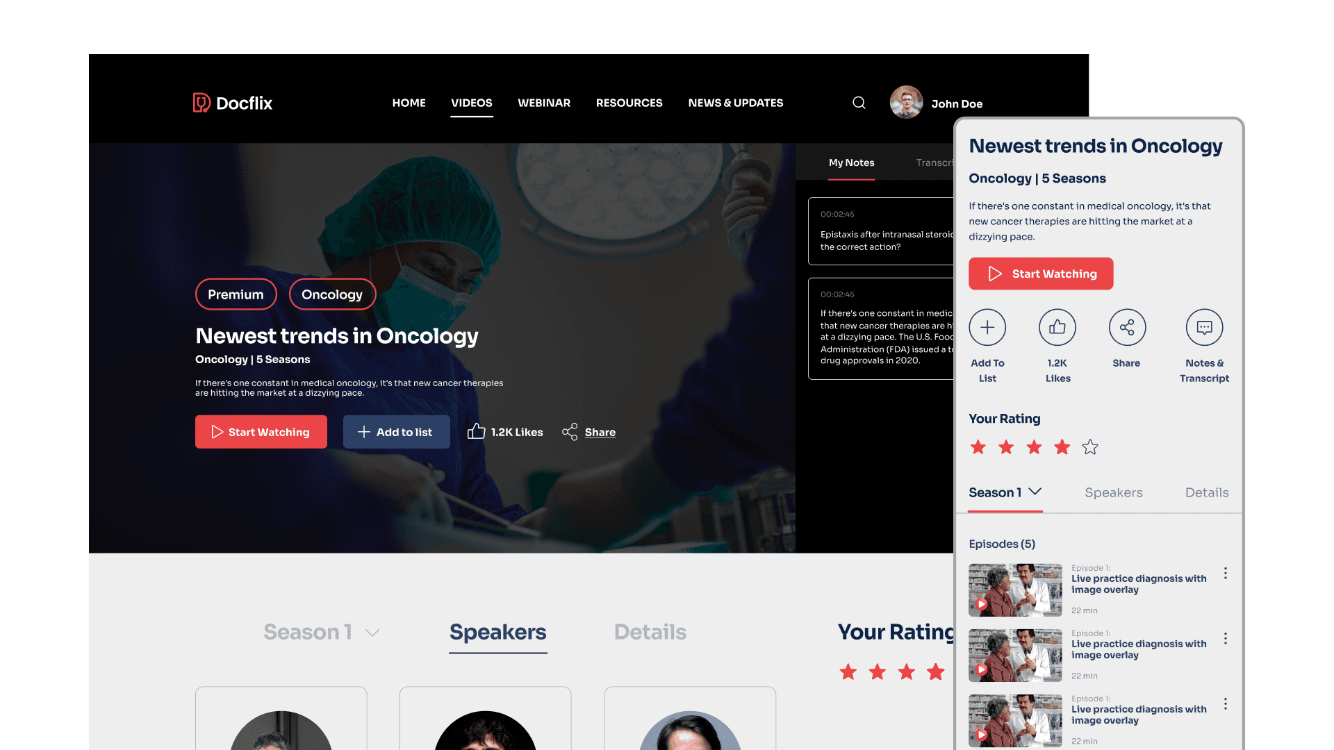
Video Layout Page
This screen shows all the video section of the docflix, it would show information
about the video, notes which you can make from the video, shows all the episodes, the speakers info of the video, you can rate the video as well.
This screen shows all the video section of the docflix, it would show information
about the video, notes which you can make from the video, shows all the episodes, the speakers info of the video, you can rate the video as well.
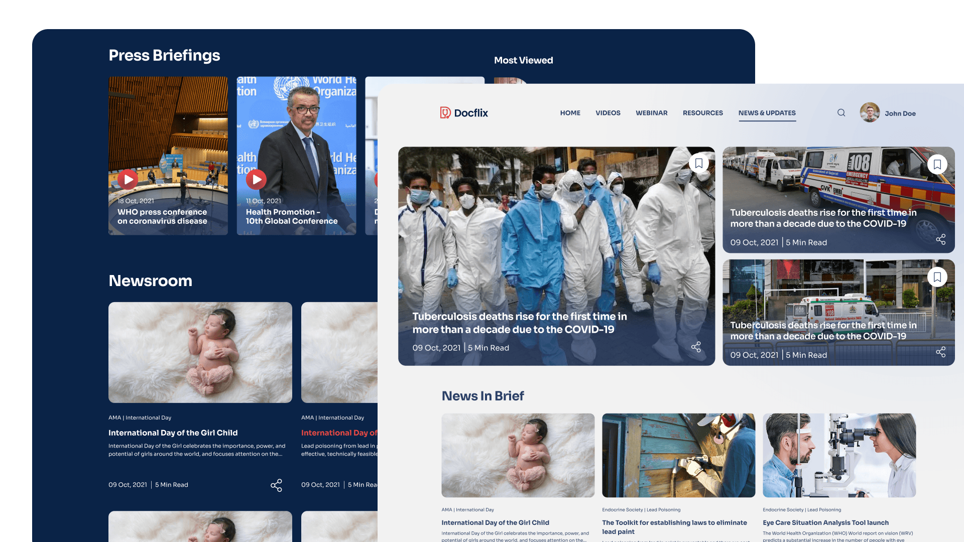
News and update landing page
This screen shows all the medical related news updates from the country, they are
categorised into current, popular, news in brief, newsroom, etc.
This screen shows all the medical related news updates from the country, they are
categorised into current, popular, news in brief, newsroom, etc.
Next Steps
Next Steps
Docflix was planned to evolve with:
AI-driven personalization
Smarter recommendations
Larger content library
More webinars and expert sessions
Higher doctor engagement
My UI system was built to scale with these additions.
Docflix was planned to evolve with:
AI-driven personalization
Smarter recommendations
Larger content library
More webinars and expert sessions
Higher doctor engagement
My UI system was built to scale with these additions.
Key Learnings
Key Learnings
Design must shape user behavior and outcomes, not just visual interfaces. In healthcare products, credibility and trust are core design considerations. Expert users require efficiency, clarity, and structured experiences over aesthetics. Content strategy and experience design are deeply interdependent in video platforms. Strong products align real user value with scalable business impact.
Design must shape user behavior and outcomes, not just visual interfaces. In healthcare products, credibility and trust are core design considerations. Expert users require efficiency, clarity, and structured experiences over aesthetics. Content strategy and experience design are deeply interdependent in video platforms. Strong products align real user value with scalable business impact.
2025 Sahil Islam. All Rights Reserved
2025 Sahil Islam. All Rights Reserved