Designing a scalable platform that empowers matchmakers and builds trust.
Designing a scalable platform that empowers matchmakers and builds trust.
Matchmakers is a mobile-first digital platform that connects match-seekers with verified local matchmakers, helping people find life partners in a way that respects Indian traditions while using modern digital tools.
Unlike typical matrimony apps, Matchmakers does not replace human matchmakers — it empowers them digitally, creating a hybrid system that blends offline cultural practices with online convenience, transparency, and trust.
I worked on this project from concept to high-fidelity prototype, collaborating closely with stakeholders and playing a key role in shaping both the UX and the visual identity of the product.
Matchmaker
Matchmaker
Matchmaker
Role
Role
User Research, User Interviews, Prototyping, Experience Design
User Research, User Interviews, Prototyping, Experience Design
Time
Time
6 Month, April 2023-September 2023
6 Month, April 2023-September 2023
Tools
Tools
Figma
Figma
Team Mates
Team Mates
Abhishek Sharma, Twinkle Budhiraja, Raj Vichare, Diksha Ashok, Anna Mary Sojan
Abhishek Sharma, Twinkle Budhiraja, Raj Vichare, Diksha Ashok, Anna Mary Sojan
My role
My role
I was leading the UI & Visual Aspect, and also contributed to UX through:
What I owned:
Visual design direction of the app
Brand system (colors, typography, components)
Illustration direction (Indian cultural aesthetics)
Final high-fidelity screens
Interactive prototype
What I collaborated on (UX):
User flows for match-seekers and matchmakers
Information architecture
Wireframes (15+ sitemaps, 150+ wireframes)
Feature definition and screen structure
Challenge
Challenge
Product Perspective
Product Perspective
Matchmaking in India is deeply rooted in family, community, and trust. However:
Most online matrimony platforms feel transactional and impersonal.
Fake profiles and lack of verification create distrust.
Traditional matchmakers still operate mostly via WhatsApp and phone calls.
Users struggle to find quality matches across multiple platforms.
Matchmakers needed to:
Digitalise traditional matchmaking
Preserve cultural values
Build trust
Make the experience simpler and more transparent
UX Perspective
Designing for two very different users in one platform:
Match-seekers needed:
Real, verified profiles
Help from trusted matchmakers
Less complexity
Fewer paid subscriptions across platforms
Matchmakers needed:
Better client management
Digital tracking instead of WhatsApp chaos
Wider reach beyond local networks
Easier payment tracking
This required two parallel user journeys with overlapping touchpoints.
of marriages in India
are arranged
weddings happen
annually in India
dollar is the annual
Indian wedding industry
Design Principle and key insights
Design Principle and key insights
We began with stakeholder interviews and a structured questionnaire to understand:
How people currently find partners
Pain points in existing systems
Expectations from a digital platform
Key insights:
Trust is the biggest barrier in online matchmaking.
People still prefer matchmakers over fully automated apps.
WhatsApp-based matchmaking is inefficient and chaotic.
Users are exhausted by multiple paid matrimony apps with low success rates.
Matchmakers struggle with client tracking and digital tools.
Core Jobs to Be Done
For Match-seekers:
“Help me find a serious, compatible partner I can trust.”
For Matchmakers:
“Help me manage my clients digitally and grow my business.”
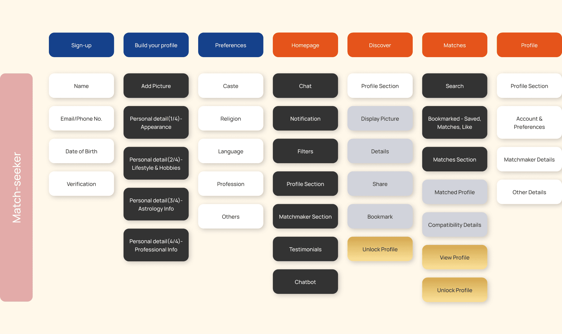
Matchseeker Information Architecture
Matchseeker Information Architecture
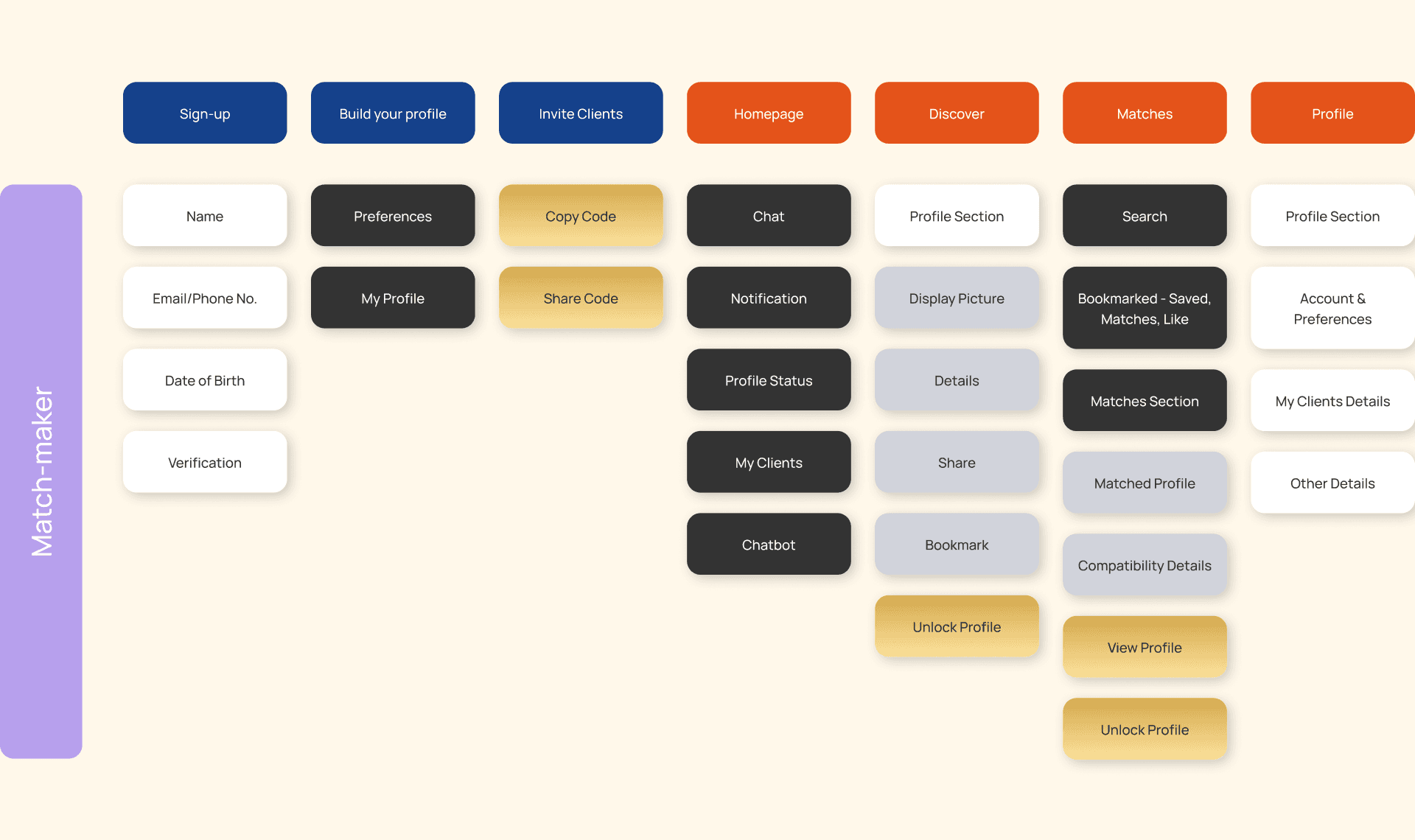
Matchmaker Information Architecture
Matchmaker Information Architecture
Goals
Goals
Business Goals
Build a trusted pan-India matchmaking platform
Onboard more matchmakers and match-seekers
Introduce a subscription model (pay-per-profile)
Expand into wedding planning and vendor services
Become a one-stop wedding ecosystem
Build a trusted pan-India matchmaking platform
Onboard more matchmakers and match-seekers
Introduce a subscription model (pay-per-profile)
Expand into wedding planning and vendor services
Become a one-stop wedding ecosystem
User Goals
Match-seekers wanted:
Genuine profiles
Expert matchmaker guidance
Easier family communication
Better quality matches
Matchmakers wanted:
Digital tools to manage clients
Broader reach
Better payment tracking
Easier profile sharing
Match-seekers wanted:
Genuine profiles
Expert matchmaker guidance
Easier family communication
Better quality matches
Matchmakers wanted:
Digital tools to manage clients
Broader reach
Better payment tracking
Easier profile sharing
Design Screens
Design Screens
Redefining
Built separate user flows for match-seeker and matchmaker
Created information architecture for both journeys
Iterative wireframing and client feedback
Design Direction
We chose a mobile-first approach with a blend of:
Matrimony experience
Social media interaction
Traditional trust signals
We chose a mobile-first approach with a blend of:
Matrimony experience
Social media interaction
Traditional trust signals
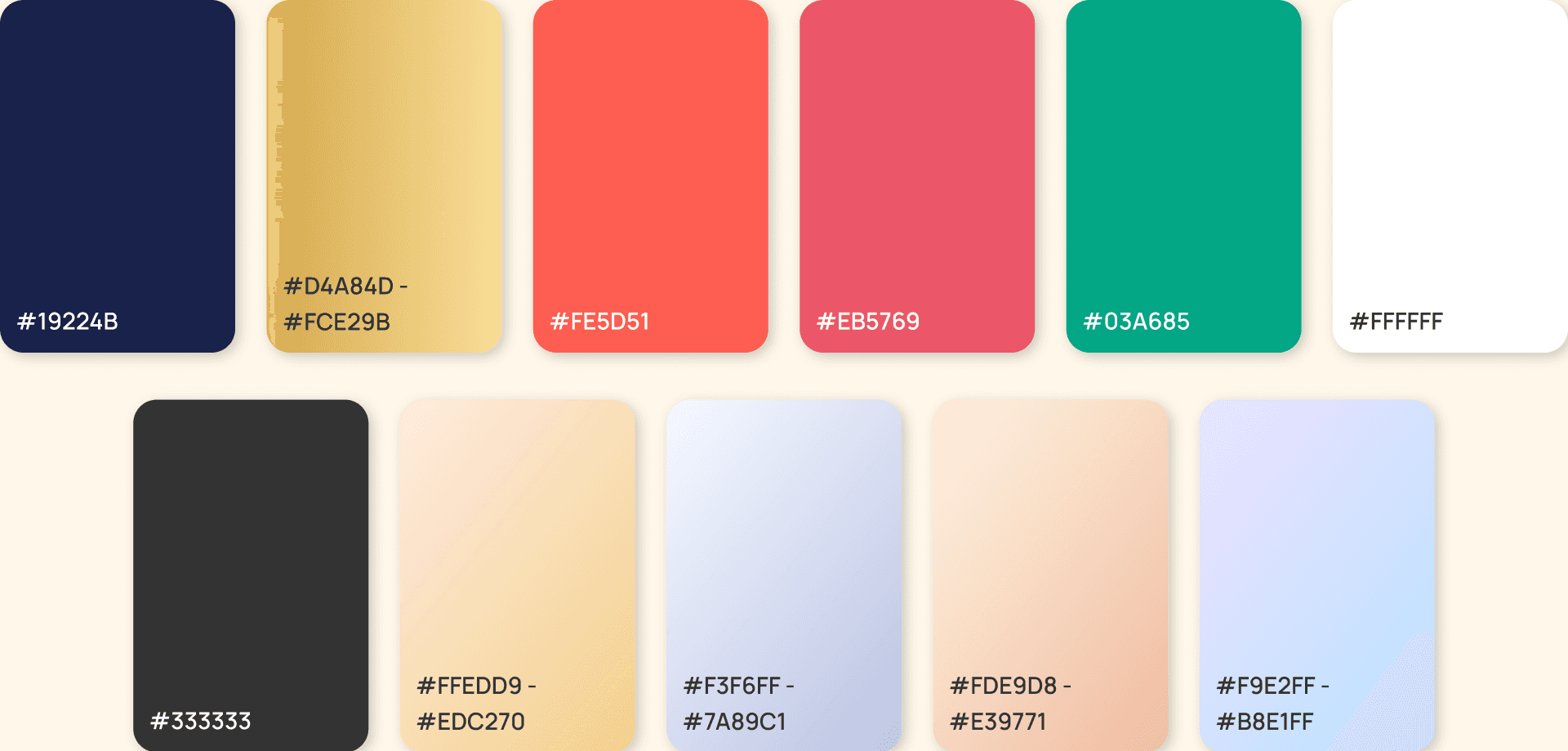
Visual Identity
Primary color: Royal Navy Blue → trust, stability, reliability
Secondary color: Gold → luxury, wedding, tradition
Typography:
Playfair Display (headings — elegant, premium)
Open Sans (body — clean, readable, multilingual)
Primary color: Royal Navy Blue → trust, stability, reliability
Secondary color: Gold → luxury, wedding, tradition
Typography:
Playfair Display (headings — elegant, premium)
Open Sans (body — clean, readable, multilingual)
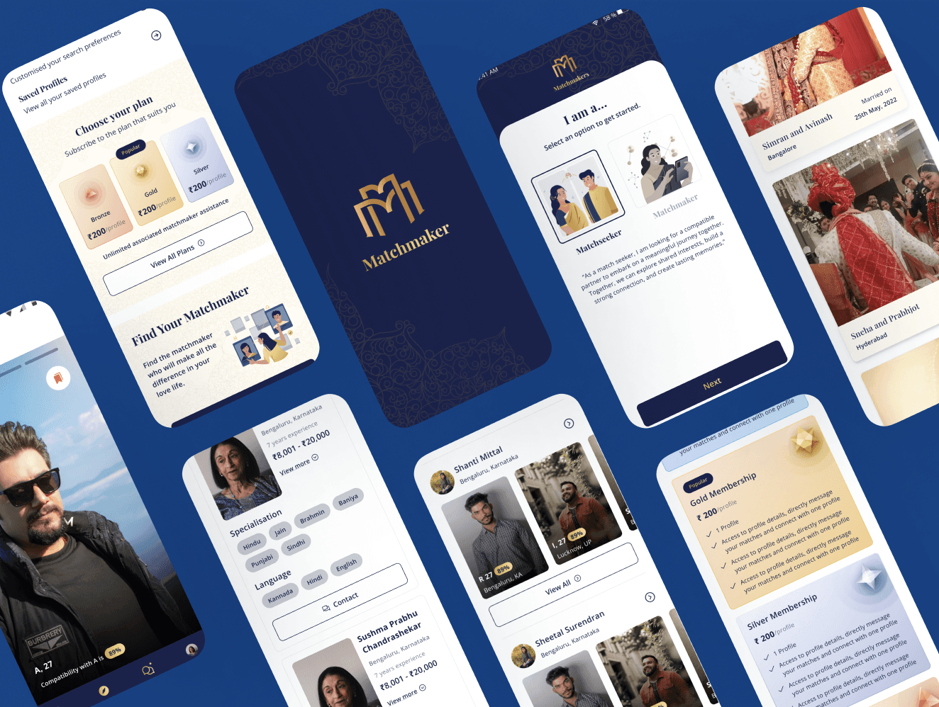
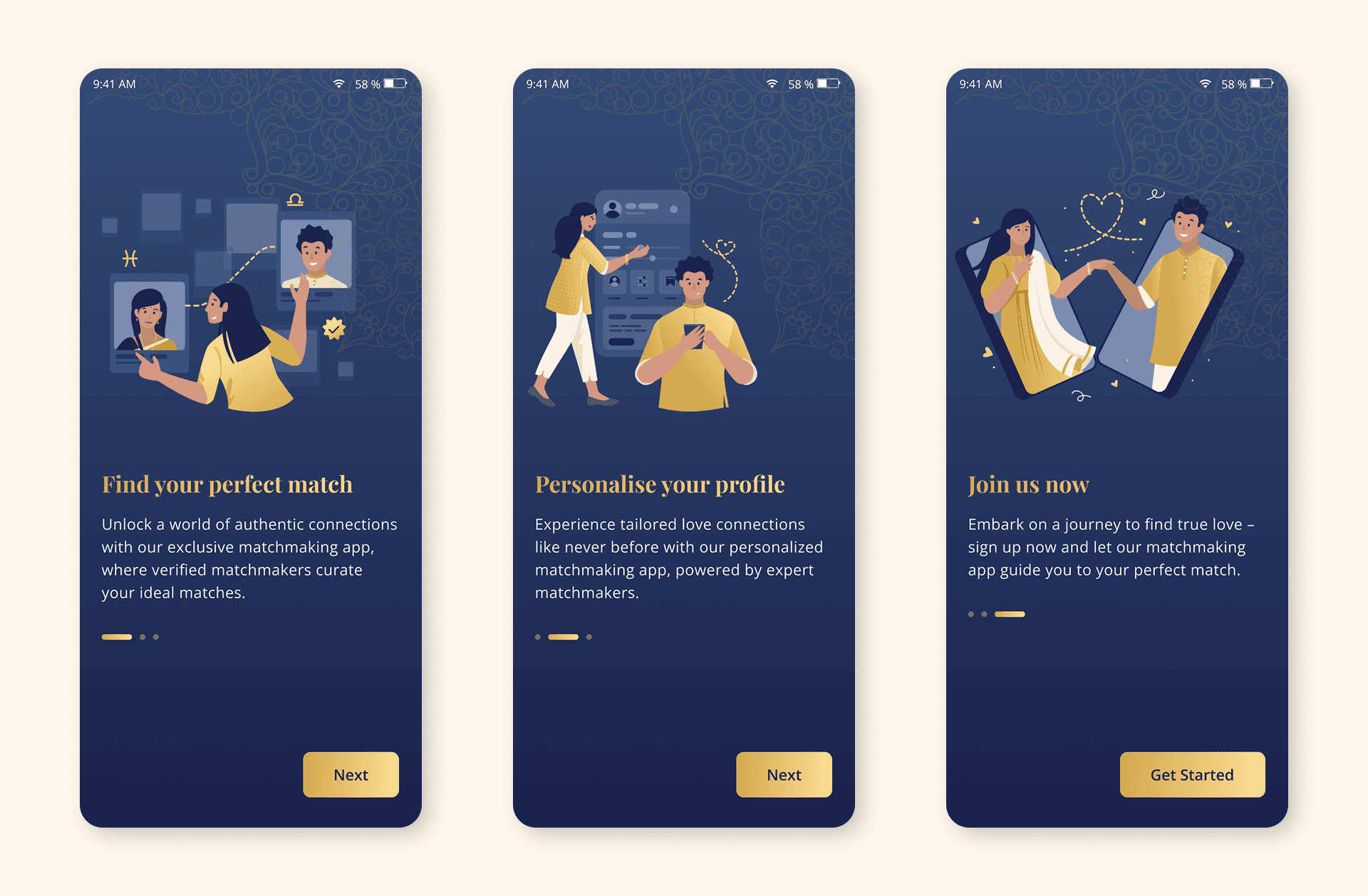
Onboarding Screens
We made the mobile app onboarding as a carousel based swipe interaction which was intended to delight the user while providing essential informations regarding the product offerings.
This screens had to be attractive for the user to feel enthusiastic about exploring the app.
We made the mobile app onboarding as a carousel based swipe interaction which was intended to delight the user while providing essential informations regarding the product offerings.
This screens had to be attractive for the user to feel enthusiastic about exploring the app.
Homepage Screens
As the product have 2 laterals, one for match-seeker and one for matchmaker, we have 2 homepage for each. The homepage helps us know about the important information required to access.
For match seeker it shows all the potential partners and which matchmaker they are associated with.
For match-maker, it shows all it’s current clients i.e. match-seeker and what’s the status of their journey to find the partner.
We decided to go with 3 fold filter-profile-preference split display as our research suggested that the user usually works with these three pieces of information to make decisions for choosing the right partner for themselves.
Find your matchmaker
Find your matchmaker section helps you find the matchmaker near you or any matchmaker according to your preference. When user don’t have a matchmaker, it will show a message that the user needs to get a matchmaker.
When we click on the connect button, a bottom sheet will appear with which user(match-seeker) can send a personalised message to invite matchmaker to collaborate and help the user with potential partner requirements.
Discover Screen
The discover page shows all the profiles near you in a reel format so as to give a social media experience into the platform. If you’re a matchmaker, you can easily share the profile to your client based on their compatibilty.
The discover page shows all the profiles near you in a reel format so as to give a social media experience into the platform. If you’re a matchmaker, you can easily share the profile to your client based on their compatibilty.
Membership Plan Screen
Membership plan page shows the user different type of membership plan which are categorised into 4 types: GOLD, SILVER, BRONZE, DIAMOND plan. You can select it and review it and pursue your plan according to your requirement.
Membership plan page shows the user different type of membership plan which are categorised into 4 types: GOLD, SILVER, BRONZE, DIAMOND plan. You can select it and review it and pursue your plan according to your requirement.
Impact
Impact
The first prototype was presented to the Government of Karnataka, and the client received funding of 100,000 Euros to build the product.
The app moved into development with a planned market launch in 2024.
The platform set the foundation for future wedding services including venues, planners, caterers, and photographers.
Key Learnings
Key Learnings
This was my first project which was focused on People based Product which I lead on the Visual Aspect End-to-end. I was involved in each stages, from discovery to Delivery and these are some pointers which i learned:
Design can deeply impact people’s lives, especially in cultural contexts like marriage.
Technology should modernize tradition — not erase it.
Trust is the most important design principle in sensitive domains.-
UX is not just about usability; it’s about emotions, safety, and relationships.
2025 Sahil Islam. All Rights Reserved
2025 Sahil Islam. All Rights Reserved